

Designing the Cubyts Website: Clarity, Cohesion, and Intuitive Flow
When we decided to refresh the single page Cubyts website, I knew we had to sharpen how the site communicates the product features, to tell the story of why Cubyts exists, and to feel like a platform people want to explore, learn and use to their benefit.
Refining the
Visual Language
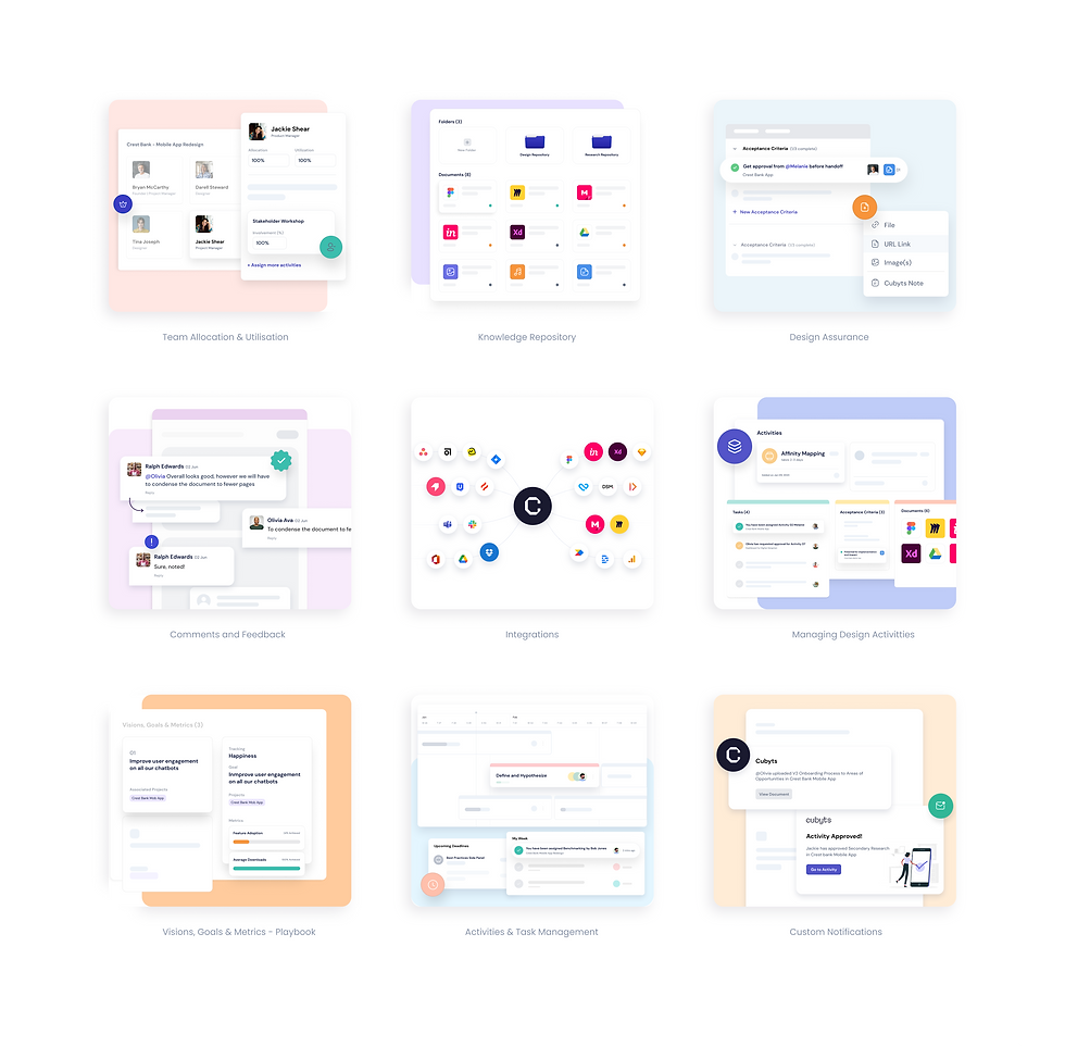
One of the first things I noticed was that while the product had strong features, the styling was inconsistent. So, I worked to implement a refined colour palette, cleaner typography, and a more coherent set of stylistic elements.
These visual choices were made so that everything — from the mega-menu to the blog template — felt part of one unified world.


Optimising Structure & Flow
It wasn’t just about how it looked, but how people move through it.
I reorganised the information architecture
to make navigation intuitive: key features accessible, menus more logical, and pages arranged so that users can dive into what they came for without friction.
Enhancing Content Spaces
The blog and resources needed to continue feeling warm and welcoming, but also professional. I designed dynamic layouts for blog posts, ensuring reading felt like a journey, not a task.
Each template, from feature pages to articles, was rethought to balance white space, visuals, and text so the tone stays engaging.


This project was developed and run alongwith the awesome team at Cubyts.
I do not claim ownership of any content used and share credit with the team.