
Branding for the food and beverage industry
The FnB industry is where brand identity goes far beyond just a logo. It becomes part of the experience. From the colour of the napkins to the way a takeout box feels in your hand, every touchpoint is essential.
My work here has been about creating identities that feel authentic to the space, while giving each brand its own personality. I’ve had the chance to rebrand legacy restaurants, craft identities for new cloud kitchens, and design playful neighbourhood cafés. For some of these I set a full foundation, while others focused on shaping specific brand touchpoints.


Connecting Cultures Through Home-Cooked Meals
Kitchko is an Australia-based cloud kitchen setup. It is a platform where people can order home food cooked by wonderful home chefs. Each chef cooks authentic recipes from their cuisines. This varies from Greek to Vietnamese to Spanish food!
The goal was to create an identity that carried warmth and nostalgia but also communicated the modern, community driven ethos of Kitchko.


Here's how we built the brand framework:
Colour Palette & Mood:
We selected warm food tones, bright oranges and yellows, paired with a fresh green and neutral beige, to evoke a nostalgic, homey vibe. These colours also work beautifully across various media, from social visuals to printed materials.
Logo & Visual Identity:
Crafted a simple yet friendly wordmark paired with an illustrated motif.
The rounded & soft illustrated shapes, the use of brush strokes in typographic elements, balanced the modern, clean and subtle wordmark to embody Kitchko’s community spirit.
Touchpoints & Consistency:
From digital assets to physical collateral, we ensured the brand visuals stayed consistent.
The aim was an identity that feels coherent whether someone sees it online, engages with a chef, or holds a branded card.


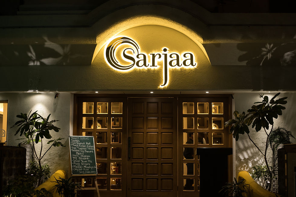
A Legacy Brand Reimagined
Anyone in Pune knows the legacy Sarjaa carried. With the city’s explosion of new restaurants, a rebrand was needed to honour their roots while bringing them into a fine dining space.
We created a sophisticated brand logo that subtly referenced the name Sarjaa (rising sun). The menu became the stage for authenticity, featuring hand-painted illustrations that celebrated their legacy. It was about making the brand look forward without losing sight of where it began.


Designing Calm and Serenity in Dining Spaces
Arbour, a neighbourhood restaurant, (rightly named) wanted its brand to mirror the serene dining experience they were creating. Here, branding went beyond the visible, it was about the intangible feeling guests took away.
We developed a brand palette that extended throughout their identity and physical space, carefully balancing serene tones with warmth. We also crafted a type-based logo and monogram that embodied the restaurant's elegant yet grounded character.


Vibrant, and Spirited menu for a Gastro Pub Experience
Elephant & Co., a well-loved gastro pub in Pune, was a playground of energy. Their space was dominated by dark black interiors, and we saw an opportunity to contrast that with design.
We developed a flat, vibrant illustration style that injected personality and vivacity into the brand. This playful contrast resonated with the spirited atmosphere the pub is known for.


This project was developed and run alongwith the awesome team at Out And Out Design.
I do not claim ownership of any content used and share credit with the team.